Dreamtime
Perth Western Australia
|
16 of 77
Wed 5th Jun 2013 4:02am
BEAM ME UP SCOTTIE !!!!!!  |
|
Schools and Education -
Coventry's Universities
|
NeilsYard
Coventry
|
17 of 77
Wed 5th Jun 2013 9:44pm
Have to say I like the Lanchester Library........... It'll never be the old Cov we all love but like the Far Gosford Street developments it's better than many Council changes |
|
Schools and Education -
Coventry's Universities
|
AD
Allesley Park
|
18 of 77
Fri 7th Jun 2013 11:34am
I quite like them. I wouldn't want many more buildings like this built but the odd one or two just adds something different, and are much more likely to stick in the mind of a visitor (if they actually saw them as unfortunately where they are they're unlikely to) than many of the alleged 'icons' of the city.
The library is a bit 'prisony', and as the bricks get dirtier over time it may start looking a bit grim but is apparently very efficient.
The engineering building is a very interesting shape and I like the stark contrast of the futuristic design against the Whitefriars Ruin. The biggest shame is that it is largely covered up from everywhere except the ringroad flyover and within that part of the uni campus, which few people get to see. It looked good from Gulson Road as it was being built, again with the contrast with the old city wall but set back enough so as not to dominate it, and then they ruined it by putting a rectangular block with the same facade really close to the wall, and now it looks a bit odd and shoehorned in without any thought to the wider picture.
It's a bit like Selfridges in Birmingham - a bit love it or hate it and you either think it looked really odd opposite the old church or a fantastic foil for it, but either way it's unique not something anyone would look at a photo and think "Where did we see that? It could have been anywhere"
The car park looked better in the renders, as the cladding was more symmetrical, but for a car park it looks good. |
|
Schools and Education -
Coventry's Universities
|
dutchman
Spon End
|
19 of 77
Mon 10th Jun 2013 3:50am
|
|
Schools and Education -
Coventry's Universities
|
|
Dreamtime
|
20 of 77
Mon 10th Jun 2013 5:39am
|
|
morgana
the secret garden
|
21 of 77
Mon 10th Jun 2013 11:20am
Ticky tacky is spot on, Dutchman, no character, no imagination, no choice, no variety, everything is the same  |
|
Schools and Education -
Coventry's Universities
|
Midland Red
Thread starter
|
22 of 77
Mon 10th Jun 2013 12:05pm
On 10th Jun 2013 11:20am, morgana said:
Ticky tacky is spot on, Dutchman, no character, no imagination, no choice, no variety, everything is the same 
Sorry! Are we talking about the same buildings here?
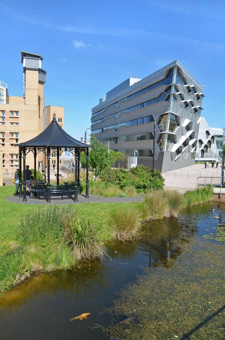 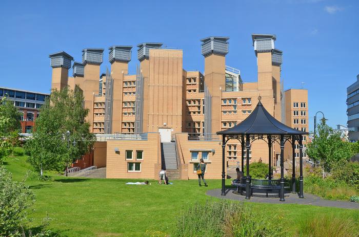
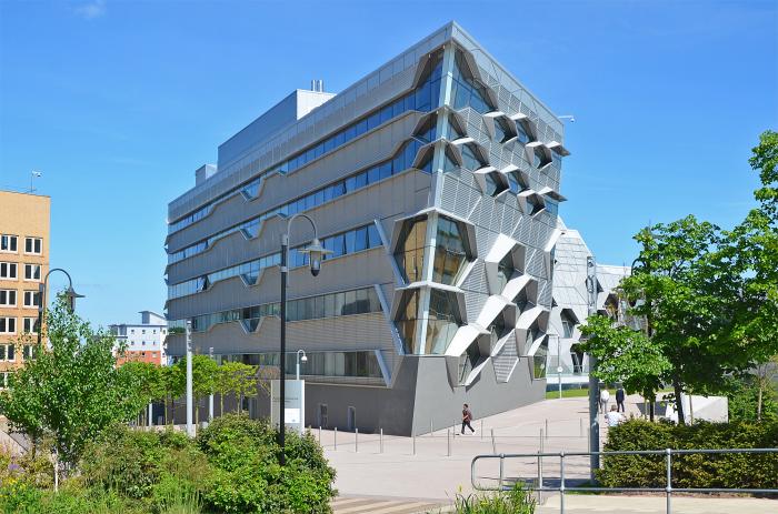 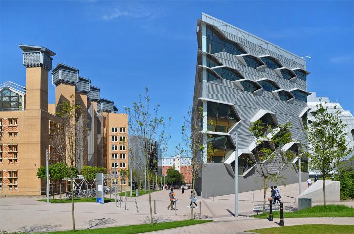
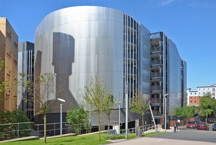
I don't see little boxes, with no character, with no imagination, with no choice, with no variety, everything the same - I see bright, modern buildings with irregular shapes, designed with imagination to create something different - I appreciate they may not be everyone's cup of tea, but they are clearly not "little boxes, all the same", they are different and have their own character |
|
Schools and Education -
Coventry's Universities
|
morgana
the secret garden
|
23 of 77
Mon 10th Jun 2013 3:03pm
To me and others, yes even the young, it's like modern art like Picasso which I hate, perhaps you didn't see the link I placed on awhile ago of Michael Portillo's comment about our city when visiting here on his programme, his positive comment was about Spon Street, also our historic buildings hidden, and you should have seen his face on the modern buildings, why will he return now he's seen Coventry for the likes of Spon Street etc not the modern stuff. As for choice where shopping is concerned it's the same as any other developed town like this. Only the other day a young mother stated she can't be bothered to go to Coventry and she lives right by the town while on a bus I was on, she shops elsewhere. I also wonder how long will these structures keep their new look before looking shabby and out of date. |
|
Schools and Education -
Coventry's Universities
|
Midland Red
Thread starter
|
24 of 77
Mon 10th Jun 2013 3:42pm
You miss my point, morgana - Dutchman referred us to a song called Little Boxes which contains the phrase "looking all the same", then you made your comments - these two things appeared to be in response to my photos of the thread subject, which is Coventry University
Neither little boxes and looking all the same, nor any of your points, can be applied to the buildings in the photos
Michael Portillo in Spon Street and your friend's choice of shopping location do not have any relevance to Coventry University campus either
Oh, and I don't like Picasso either - wouldn't know which way up to hang it!  |
|
Schools and Education -
Coventry's Universities
|
dutchman
Spon End
|
25 of 77
Mon 10th Jun 2013 3:48pm
You either "get it" or you don't "get it" Cliff.
You obviously don't "get it".
|
|
Schools and Education -
Coventry's Universities
|
AD
Allesley Park
|
26 of 77
Mon 10th Jun 2013 4:32pm
On 10th Jun 2013 11:20am, morgana said:
Ticky tacky is spot on, Dutchman, no character, no imagination, no choice, no variety, everything is the same 
Sorry, but whether you like or dislike them, none of the above criticisms are valid.
None of those buildings could be mistaken for the other - in terms of design or materials. They are very, very different. That is part of the reason I like them - the massive contrasts between them.
No imagination? Both of these buildings needed ages in planning - the library to make it energy efficient and the engineering building to make sure the design was technically feasible.
The irony is that given many people's desires for the city centre, that would result in far less variety and everything looking the same. I love the Manor House and Ford's Hospital, but there are very similar looking buildings in many other towns and cities - York, Stratford, Chester etc. Whereas tell me one place that has something that looks like that engineering building?
And by the way I can't stand modern art either - I much prefer classical.
|
|
Schools and Education -
Coventry's Universities
|
morgana
the secret garden
|
27 of 77
Mon 10th Jun 2013 4:32pm
On 10th Jun 2013 3:42pm, Midland Red said:
You miss my point, morgana - Dutchman referred us to a song called Little Boxes which contains the phrase "looking all the same", then you made your comments - these two things appeared to be in response to my photos of the thread subject, which is Coventry University
Neither little boxes and looking all the same, nor any of your points, can be applied to the buildings in the photos
Michael Portillo in Spon Street and your friend's choice of shopping location do not have any relevance to Coventry University campus either
Oh, and I don't like Picasso either - wouldn't know which way up to hang it! 
As this has taken a large part of the town how long will it be before the whole town looks like this to fit in, not so long ago they put up a design not unlike these to replace Cathedral Lanes, how Coventry can brand itself historic the rate it's going I don't know with all the demolition bit by bit replacing new ugly design, tomorrow's eyesore, as like the designs so like the people who think of these boring structures, no detail of sculpture fine art to fit our history. I notice these people who give the go ahead also the designers don't live in properties like it or close by the ones they build either. I just fear this will extend to the town eventually.
|
|
Schools and Education -
Coventry's Universities
|
Midland Red
Thread starter
|
28 of 77
Mon 10th Jun 2013 4:50pm
On 10th Jun 2013 3:48pm, dutchman said:
You either "get it" or you don't "get it" Cliff.
You obviously don't "get it".
What is the "it"?  |
|
Schools and Education -
Coventry's Universities
|
Midland Red
Thread starter
|
29 of 77
Mon 10th Jun 2013 4:52pm
On 10th Jun 2013 4:32pm, AD said:
On 10th Jun 2013 11:20am, morgana said:
Ticky tacky is spot on, Dutchman, no character, no imagination, no choice, no variety, everything is the same 
Sorry, but whether you like or dislike them, none of the above criticisms are valid.
None of those buildings could be mistaken for the other - in terms of design or materials. They are very, very different. That is part of the reason I like them - the massive contrasts between them.
No imagination? Both of these buildings needed ages in planning - the library to make it energy efficient and the engineering building to make sure the design was technically feasible.
The irony is that given many people's desires for the city centre, that would result in far less variety and everything looking the same. I love the Manor House and Ford's Hospital, but there are very similar looking buildings in many other towns and cities - York, Stratford, Chester etc. Whereas tell me one place that has something that looks like that engineering building?
And by the way I can't stand modern art either - I much prefer classical.
 |
|
Schools and Education -
Coventry's Universities
|
Midland Red
Thread starter
|
30 of 77
Mon 10th Jun 2013 4:54pm
On 10th Jun 2013 4:32pm, morgana said:
As this has taken a large part of the town how long will it be before the whole town looks like this to fit in, not so long ago they put up a design not unlike these to replace Cathedral Lanes, how Coventry can brand itself historic the rate it's going I don't know with all the demolition bit by bit replacing new ugly design, tomorrow's eyesore, as like the designs so like the people who think of these boring structures, no detail of sculpture fine art to fit our history. I notice these people who give the go ahead also the designers don't live in properties like it or close by the ones they build either. I just fear this will extend to the town eventually.
 |
|
Schools and Education -
Coventry's Universities
|